
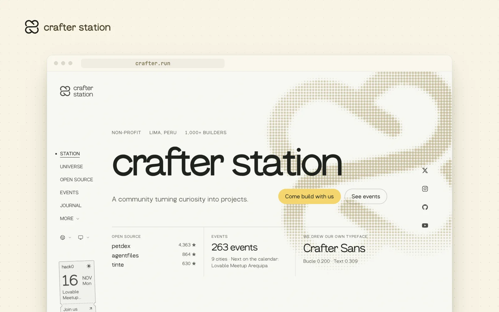
crafter.run has a new design. The Station redesign replaced the old site across the homepage, the Journal, the Universe and the Agenda, set everything in Crafter Sans, and gave the team one set of portraits.
One editorial system#
Every page shares the same paper, ink and type, with a left rail for navigation and the next event pinned in the corner. Sections that used to look like separate sites now read as one.
Built around what we make#
The homepage leads with what the community ships: open source with live stars, events, and Crafter Sans. Ships, events and the team each have their own page in the same style.
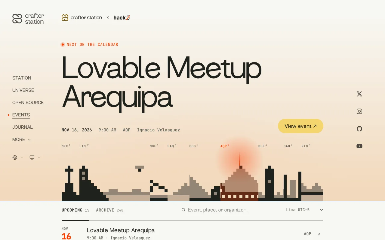
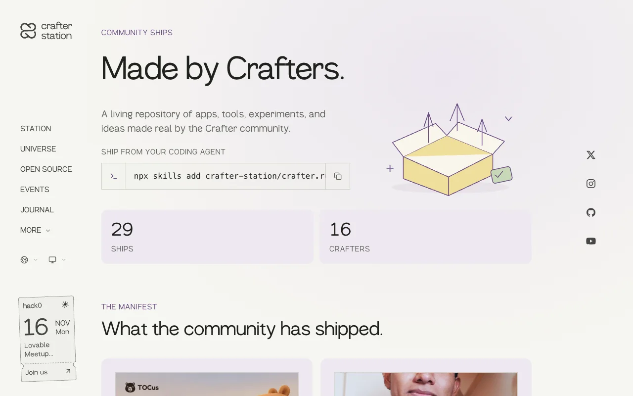
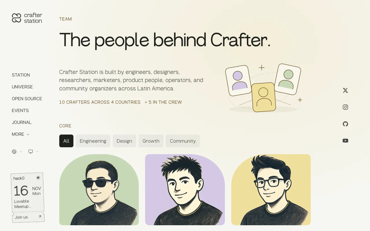
Screens show crafter.run today, which kept building on the redesign after launch.
Try it#
Visit crafter.run.
What changed#
- The Station editorial design replaced the previous site across the homepage, Journal, Universe, Agenda and secondary pages (#90).
- The site uses the Crafter Sans runtime fonts and unified team portraits.