
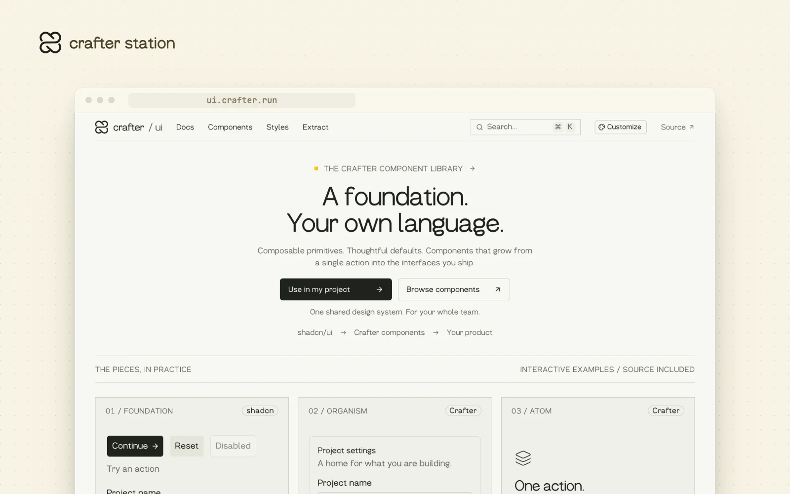
Crafter UI is a component library for teams who want shadcn defaults with their own identity on top. It is built on shadcn Base UI, with shared light and dark tokens and a layer of Crafter atoms, molecules and organisms. Start at ui.crafter.run.
Browse every component#
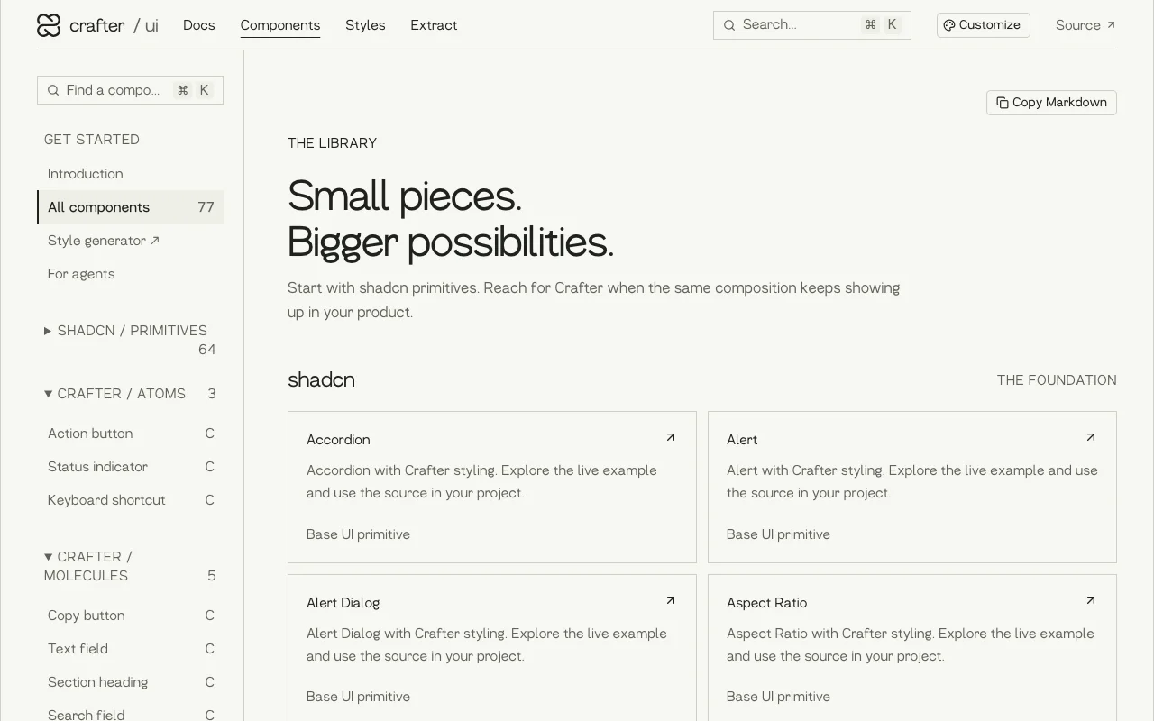
The components page lists the shadcn primitives next to the Crafter atoms, molecules and organisms. Each one opens a live example with its source, and any page can be copied as Markdown for your agent.
Make the library yours#
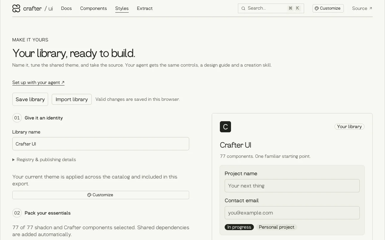
The style generator lets you name your library, tune the shared theme and pick the components you need. It exports a separate registry, so your team installs your version, with your tokens.
Try it#
Open ui.crafter.run, click Use in my project and paste the prompt into your coding agent. The design guide at crafter.run/design.md gives your agent the shared component and token conventions for future UI work.